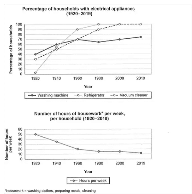
The line graphs show the percentage of families that owned electrical appliances during the period between 1920 and 2019 and the number of hours that each household spent on housework in a week.
Overall, it can be seen that very few households owned refrigerators in 1920. By contrast washing machines and vacuum cleaners were more widely used.
While in 1920, only about 5% of homes owned refrigerators, as much as 40% of them owned washing machines. In the same year 30% of families had vacuum cleaners. The ownership of refrigerators increased dramatically over the next 60 years. By then as much as 100% of families owned refrigerators. There was no drop in the ownership of refrigerators over the next 40 years. Vacuum cleaners followed a similar trend. By 2000, they have reached all households.
Interestingly, the ownership of washing machines did not increase drastically. While it did increase from 1920 to 1960, afterwards its ownership declined steadily and then it increased again. By 2019, about 75% of households owned washing machines. Thanks to the widespread access to home appliances, the number of hours spent doing domestic work decreased over the years. While in 1920, on average each family spent 50 hours on housework per week, by 2019, it had dropped to just 10 hours/week.
The line graph illustrates percentage of homes owning electrical appliances (washing machine, refrigerator, vacuum cleaner) between 1920 and 2019 and compares it to the housework performed per week during the same duration.
Overall, as the usage of appliances increases the hours spent doing household chores had decreased. The usage of all three household devises had shown steady increases from 1920 to 2019. Washing machines were used by 40% in 1920, which rose to 70% in 1960 with a slight dip in 1980, after which it rose gradually to reach its peak of around 75% in 2019. Refrigerator and vacuum cleaner in 1920 were used by around 30% and 5% respectively. Moreover, both these items showed a constant rise, and peaked to 100%. Refrigerator peaked at 1980 and vacuum cleaner in 2000. Both retained 100% thereafter.
In contrast, the chores done in houses shows a gradual declining trend. Around 50 hours of work per week was put into household chores, this dropped to around 15 hours per week, coinciding with the increased use of appliances. It thereafter plateaued and reached the lowest of around 10% in 2000.
The charts provide information regarding / about the percentage of households using electrical appliances and the number of hours invested in doing housework in households in a country from 1920 to 2019. Overall, it can be seen that the ownership of all the three electrical appliances has increased. While the percentage of households with refrigerators increased drastically from 2% in 1920 to 100% in 1980 and remained constant until 2019, the percentage of vacuum cleaner owners increased steadily from 30% in 1920 to 100% in 2000. Washing machines were the most widely used electrical appliance in 1920. While 40% of the homes owned washing machines in 1920, by 2019, this appliance had reached nearly 75% of households. It is clear that with the increase in the reliability on various electrical appliances, the number of housework hours had reduced from 50 hours per week in 1920 to 20 hours per week in 1960 and this further reduced to reach almost 10 hours per week in 2019.
The given line graphs depict the changes in ownership of electrical appliances and the amount of time spent doing housework in a typical household in one country between 1920 and 2019.
The first chart showed the ownership of electrical appliances between the years 1920 and 2019. The ownership of refrigerator showed a sharp rise from the year 1920 to 1960 after which the ownership of refrigerators did not grow until 2019. This chart also depicts that in the year 1920 30% and 40% of the population were already using the vacuum cleaner and washing machine respectively. The usage of vacuum cleaner showed a steady rise of up to 90% in the year 1960 and then remained steady from the year 2000 to 2019. The ownership of washing machine almost remained the same with slight variations in the usage.
The second chart shows the usage of these electrical appliances for housework in terms of number of hours per week. It shows that the amount of usage of these electrical appliances for housework rapidly declined from the year 1920 to 1960 and then remained constant at around 10-20 hours, per week.
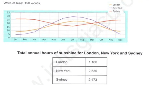
The graph and the table show the monthly temperatures recorded in three cities and the number of sunny hours that they enjoy in a year on average.
Overall, it can be seen that New York is the coldest and hottest of the three cities while Sydney and London experience minimal variation in temperatures. In New York, the coldest months are December and January when the temperature is as low as 5 degrees Celsius. London also is the coldest during these two months with temperatures hovering around 10 degrees Celsius.
Interestingly, while it is winter in London and New York, it is summer in Sydney. Sydney recorded its highest temperatures of 25 degrees Celsius in December and January. July was the coldest month in Sydney with average temperatures dropping to 15 degrees Celsius. In New York, the highest temperature of 30 degrees Celsius was recorded in July. In London, too, the hottest month of the year was July when its temperature reached nearly 25 degrees Celsius.
The table shows the total hours of sunshine that these three cities receive in a year. New York and Sydney receive a lot more sunshine than London. While New York gets 2535 hours of sunshine per year, Sydney is close behind with 2,473 hours of sunshine. By contrast, London receives just 1,180 hours of sunshine/year.
The data illustrates temperature on a monthly basis and the number of hours of sunshine three major cities receive on average.
Overall, the temperatures were the highest for New York and London in July but the lowest for Sydney. Furthermore, New York and Sydney received more sunlight than London throughout the period given.
New York and London experienced the warmest weather in July with the temperatures reaching around 30 degrees and 24 degrees respectively. December and January were the coldest months in both London and New York. While London recorded the lowest temperature of 10 degrees Celsius in these two months, in New York it was 5 degrees Celsius.
On the other hand, Sydney had to face hot days in January (around 25 degrees) and December (25 degrees) whereas cold days in July (just over 15 degrees). In terms of sunshine, London received the least amount of sunshine – 1180 hours / year on average, during the period given. New York recorded 2535 hours on average of sunshine which was more than more than what Sydney received (2473 hours/year.
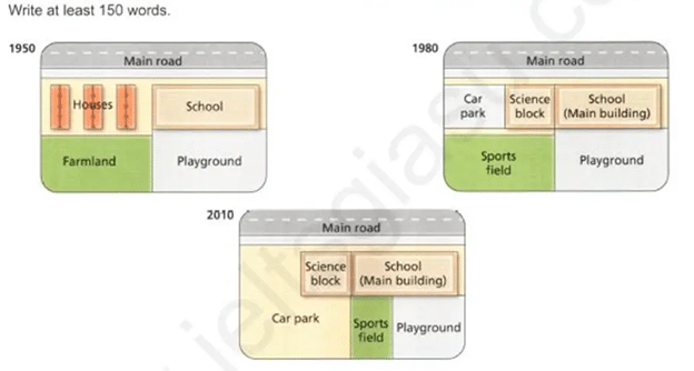
The given diagrams show the changes that took place at West Park Secondary School during the period between 1950 and 2010.
Overall, it can be seen that the school underwent considerable changes including the addition of a science block and car park. In 1950, there were houses to the west of the school and a playground to its south. To the west of the playground was farmland.
By 1980, the houses had been demolished to make way for a science block and a car park. The main school building remained the same. By 2010, the car park had been extended to cover the area previously occupied by the sports field.
Meanwhile about one-third of the playground had been converted into a sports field. Thus, obviously, the car park became bigger while the sports field and playground became much smaller. Again, there were no changes to the main school building in all these years.
The diagram illustrates the main changes that took place at the West Park Secondary School between 1950 and 2010. Overall, since 1950, the school has undergone several changes to accommodate further improvement to its learning, recreational and parking facilities.
In 1950, the school consisted of a single building and a playground located on the east side. A piece of land of the same size was occupied by houses and farmland on the west side. By 1980, houses were demolished to make way for a science block and a car park. Conversely, farmland had to be cleared to construct a sports field.
Over the next twenty years, the car park was extended, whereas the size of the sports field was reduced to achieve this change. Furthermore, the playground became smaller by about one-third. Despite these extensions, the science block and school buildings were unaffected.
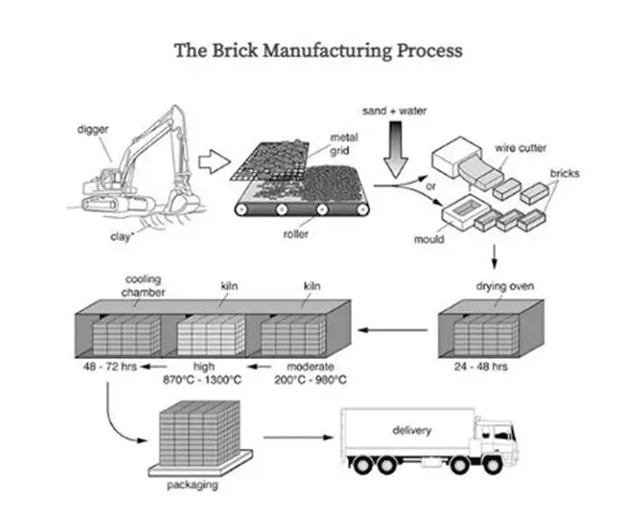
The diagram illustrates the processes involved in the manufacturing of bricks. There are mainly three stages in brick manufacturing. First, the clay is dug out with the help of a digger. It is then spread on a metal grid. Later sand and water are added to the clay. The resultant mixture is then cut into shape using a wire cutter or a mold. These wet pieces of bricks are then kept in a drying oven for up to 2 days. The dried bricks are then heated in a kiln. First they are heated to a moderate temperature ranging between 200 and 900 degrees Celsius. These hot bricks are then moved to another kiln where they are baked to temperatures as high as 1300 degree Celsius. These bricks are then moved to a cooling chamber where they are kept for 2-3 days. Finally, these bricks are packaged and delivered to construction sites by trucks.
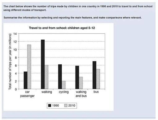
The graph given above depicts the travel made by children to and from school using different modes of transport such as car, walking, cycling, bus and walking and bus in one country in the year 1990 and 2010. The children are aged between 5 to 12 years. Children made fewer trips by car in 1990 (4.25 million) than in 2010 when it increased to 11 million trips. As it is evident from the graph, children mostly walked to school in 1990 and the number of walking trips in that year was 12.25 million trips. Children still made a fair number of walking trips in 2010 (6 million trips). Cycling was a relatively popular means of travelling in 1990) which drastically decreased to 2 million in the year 2010. Some children used both walking and bus, to and from school and made about 5.95 million trips in the year 1990 and about 3 million trips in 2010. Bus alone was used by some children as a means of transport to and from school and children made 6.75 million trips in 1990 and it reduced to 5 million in the year 2010.
The two maps show the current state of an industrial area and the changes that will take place there after its proposed redevelopment.
Overall, it can be seen that the area will undergo tremendous changes. Norbiton is an industrial area lying between a road in the south and a river in the north. The factories are on the north side of the road and a roundabout facilitates access to them.
The factories will vanish after the redevelopment and will be replaced by housing facilities, shops, a school, a medical Centre and a playground. Two more roads will diverge from the roundabout in the northward and westward direction. The road going in the north direction will cut through the river and new homes will be built around it.
A medical center will come up in the south-east portion of the roundabout and new shops will come up in the southwest of the town along the roundabout. The small road going eastward from the roundabout will now end in a school. Homes will be built on either side of this road and a playground will come up beyond the homes in the northwest of the area. While some of the farmland on the north of the river will be used for building homes, the rest will remain the same.
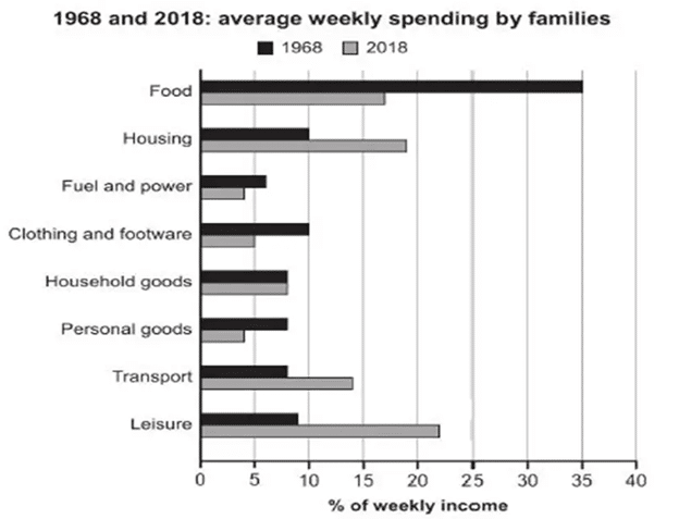
The bar chart shows the proportion of weekly income that families spent on various essential goods and services in the years 1968 and 2018.
Overall, it can be seen that in 1968, families spent the most on food and the least on fuel and power, whereas in 2018, the spending on leisure was the highest. In both years, they spent the least on fuel and power (6% and 4% respectively).
In 1968, families spent as much as 35% of the weekly income on food. Housing and clothing and footwear were the second biggest expenses. They spent 10% on each of them. Money expended on household goods, personal goods and transport was the same (8% each) in 1968 and they spent slightly more on leisure.
By 2018, leisure had become the biggest expense accounting for 22% of the weekly income. Housing was the next and families spent nearly 19% of their income on this. They also spent a considerable proportion of their income (14%) on transport. While the spending on household goods remained the same in both years, in 2018, expense related to clothing and footwear and personal goods nearly halved.
The bar chart shows the percentage / proportion of weekly income that families spent on various essentials in the years 1968 and 2018.
Overall, it can be seen that in 1968 people spent the most on food and the least on fuel and power whereas in 2018, they spent the most on leisure and the least on personal goods and fuel. In 1968, people spent as much as 35% of their weekly income on food. On the other hand, they spent only about 6% on fuel and power.
They spent the same amount (10% each) on housing and clothing and footwear whereas the spending on personal goods, household goods, transport and leisure was less than 10% of the weekly income. When it comes to the expenses in 2018, about 22% of weekly income was expensed on leisure followed by housing (19%) and food (17%). Expenditure on fuel and power, clothing and footwear and personal goods was around one-fourth of leisure expenses. Household goods and transport consisted of 8% and 14% of the weekly income.
TOPIC: The chart below gives information about how families in one country spent their weekly income in 1968 and in 2018.
The column chart illustrates the distribution of weekly earnings among families in a country in 1960 and 2018. Overall, the percentage of money sent every week on essential and personal goods such as food, fuel, or clothing in 1968 was higher than that in 2018, while others including housing, transport, or leisure activities were responsible for higher budgets in 2018.On the one hand, there was 35 percent of weekly income spent on food in 1968, which was double that in 2018 at about 17 percent. Similarly, the proportion of money used for personal goods and clothes in 2018 was only half of that in 1968 at around 10 percent and 8 percent respectively. As can be seen, over 5 percent of weekly earnings in families in that country was paid for fuel and power in 1968, compared with approximately 3 percent in 2018.On the other hand, the highest percentage of weekly income in 2018 was used for entertaining demands at over 20 percent, which was twice as much as that in 1968. Likewise, there was nearly 15 percent and 20 percent of the money paid weekly for transport and housing respectively, followed by only about 9 percent of that in 1968. Regarding household goods, these families used about 8 percent of their earnings for that in both 1968 and 2018.