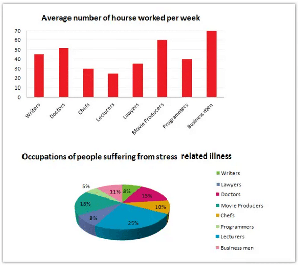
The bar graph depicts information about the average number of hours individuals dedicate to their job per week, whereas the pie chart shows the percentage of people suffering from stress-related ailments among various professional groups.
Overall, it appears that businessmen are the most susceptible to stress-based illness. It can be seen that businessmen spent the most time on their work (70 hours/week) followed by movie producers (60 hours/week) and doctors (50 hours / week). Programmers work more hours than lawyers and chefs. While lawyers work 35 hours/hour and chefs work 30 hours/week, programmers work 40 hours/week. Writers work around 45 hours / week.
Work related stress levels are the highest among lecturers and lowest among programmers. While only 5% of programmers suffer from stress related anxiety as much as 25% lectures are susceptible to it. Stress levels are also low among writers and lawyers with only 8% of them suffering from it. Movie producers (18%) and doctors (15%) are the other two groups more likely to suffer from stress ailments. Stress levels are comparatively low among businessmen with only 11% of them suffering from it.
The bar graph shows the average number of hours worked by 8 different kinds of professionals whereas the pie chart shows the prevalence of stress related illnesses among them. Overall, it can be seen that businessmen worked the most hours (70) per week while lecturers worked the fewest hours (25) per week. Movie producers on average worked 60 hours/week and doctors worked 50 hours/week. Chefs and lawyers worked fewer hours than writers and programmers.
Stress ailments are the highest among lecturers with as much as 25% of them suffering from it. 18% of movie producers and 15% of doctors also suffer from stress related ailments. Interestingly stress ailments are the lowest among programmers (5%). Other professionals who are less susceptible to stress and related problems are writers and lawyers (8% each). It is worth noting that lectures who worked the fewest hours are also the most affected by stress. Also, stress levels are comparatively low (11%) among businessmen who worked the most hours.

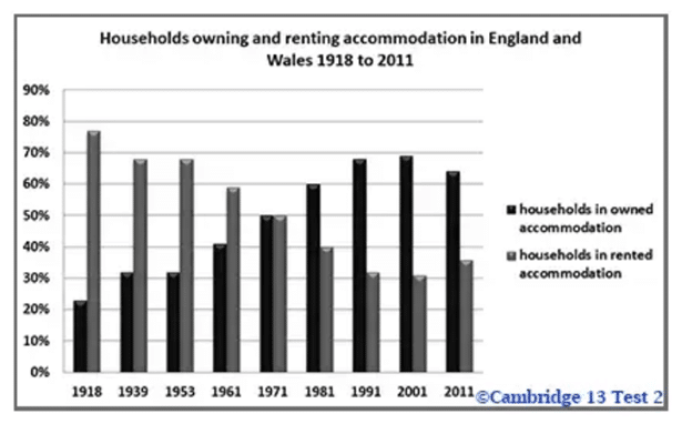
The given bar graph shows the household owning and accommodation trend in England and Wales from the year 1918 to 2011.
In the early 19th century, households who owned accommodation were less and accounted for only 20% whereas rented accommodation households were around 75%. This indicates that in 1918 people were not much interested in buying a house. Later in the years 1939 to 1953, the trend of accommodation was quite similar. Around 33% of households owned accommodation and 67% of them lived in rented accommodation.
After 1953, the percentage of households in the owned accommodation, gradually started increasing. In 1971, the percentage of households living in owned and rented accommodation was the same (%). The year 1981 started to see a hike in people owning accommodation. From 50% it went up to 60 % of households. And this year also marked the drop in the percentage of people living in the rented accommodation. In 2001, the proportion of families living in owned accommodation was the highest at 70%. The year 2011 showed a slight variation where, 65% of people lived in their own accommodation and only 35% of them in the rented houses.
As it is seen clearly, there was a decrease in the interest amongst people to live in rented accommodation towards the year 2011.
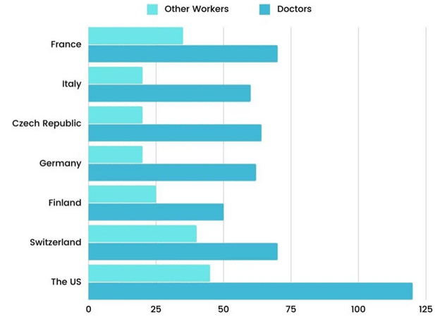
The bar chart compares the annual remuneration (in thousands of dollars) of doctors and other employees in seven nations in the year 2014. A glance at the chart reveals that American doctors earned much more than doctors or other employees in America or elsewhere. First and foremost, a doctor in the US earned $120,000/year and it is much higher than what doctors earned in other countries. The next on the list of countries with the highest remuneration for doctors are France and Switzerland. In both countries, doctors earned 70 thousand dollars per annum. However, other professionals received lower salaries. While in Switzerland they earned around $40,000/year, in France, it was even lower at $30,000/year. Doctors earned decent salaries in Germany, Czech Republic and Italy (around 60,000 dollars/year) but other workers were poorly paid (20,000dollars / year). Finally, Finland offered the lowest salaries to doctors ($50,000/year) and other workers in that country earned half of that.
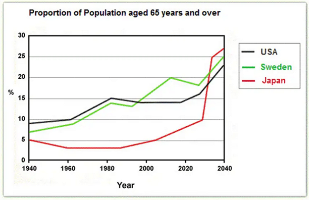
The line graph illustrates the percentage of the population aged 65 and above in the US, Sweden and Japan over a period of 100 years from 1940 to 2040. Overall, all the three countries experienced variations in the rate of population of those aged 65 years and over between the years 1940 and 2040. Japan had only 5% of men and women who were aged 65 years and above in the year 1940. After a slight fall, the population of elderly people remained stable during the next 20 years from 1960 to 1980 at 3%. Thereafter, the population faced a slight increase till 2000. By year 2040, the population of seniors in Japan is expected to be as high as 27%. On the other hand, USA and Sweden experienced similar fluctuations from the years 1940 to 2000. However, since the year 2000, population of seniors in Sweden saw an increase. It is expected to increase further and may reach as high as 25% in the year 2040. The US population of seniors remained fairly stable during 1940 and 1960 at 10%. Thereafter, it increased to 15% by 1980. It remained stable until 2000 and then started increasing. By 2040, as much as 23% of the US population is expected to be aged 65 and over.

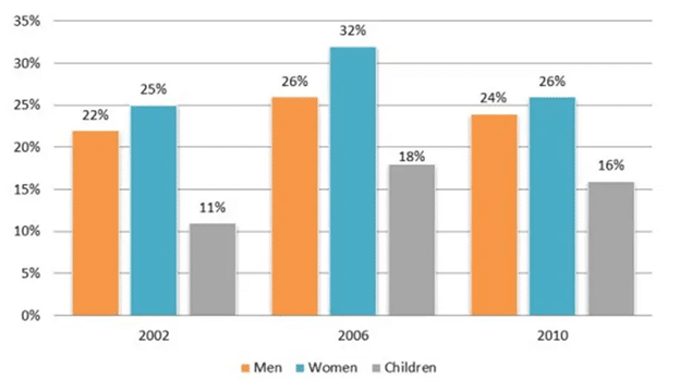
The bar graph illustrates the proportion of UK citizens who consumed the recommended amount of fruits and vegetables every day in the year 2002, 2006 and 2010. Overall, in all the three years women consumed more fruits and vegetables on a daily basis, while children ate the least amount of them. In the year 2006, the percentage of women, men and children who consumed the daily suggested amount of fruits and vegetables rose significantly to 32%, 26% and 18% from 25%, 22% and 11% respectively in the year 2002. There was about 5% increase in the consumption of fruits and vegetables among the two genders and children. However, in the year 2010, the rate of intake of fruits and vegetables decreased slightly among the females, males and kids and the proportion of the population who consumed the recommended amount was 25%, 24% and 16% respectively. Children in all the three years consumed the lowest amount of fruits and vegetables.
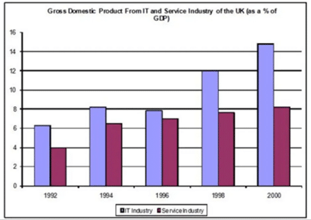
The bar chart illustrates the contribution of the IT and Service Industries to the Gross Domestic Product of the UK during the period between 1992 and 2000. Overall, the IT Industry has contributed more to the GDP than Service Industry throughout the given period. Furthermore, both industries grew over the given period; however, the contribution of the service industry was always less than that of the IT industry. In 1992, the contribution of IT Industry to the GDP was around 6%. This steadily increased during the given period except in 1996 when it fell marginally to just below 8%. After 1996, the contribution of IT Industry to the economy rose from 12% in 1998 to over 14% in the final year. In terms of the contribution of the Service Industry, it was 4% in 1992 which gradually continued to grow over the following years and reached just over 8% in 2000.
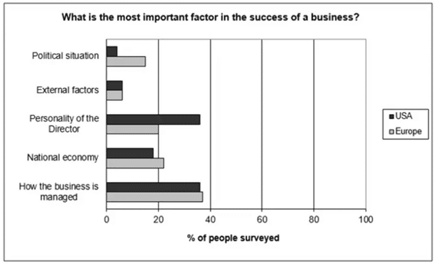
The given bar graph illustrates the outcomes of a study, where the Europeans and the Americans mention different factors which contribute to the success of their business. Overall, the most significant factor in the success of any business is the way it is managed according to most of the respondents in Europe and the USA. People / They also think that political situation and external factors have only minimal impact. Nearly 38% of people in both the given countries answered that the success of a business largely depends on the way it is run. Almost the same percentage of Americans claims that the personality of the director influences the development of any trade; however, fewer Europeans (20%) think that way. While 22% of Europeans believe that national economy can affect businesses, only 18% of Americans agree with that view. Less than 10% of people in both countries believe that external factors can affect businesses. While about 15% of Europeans consider political situation as a factor affecting business, less than 5% of Americans support that view.