The graph shows Underground Station passenger numbers in London. Summaries the information by selecting and reporting the main features, and make comparisons where relevant.
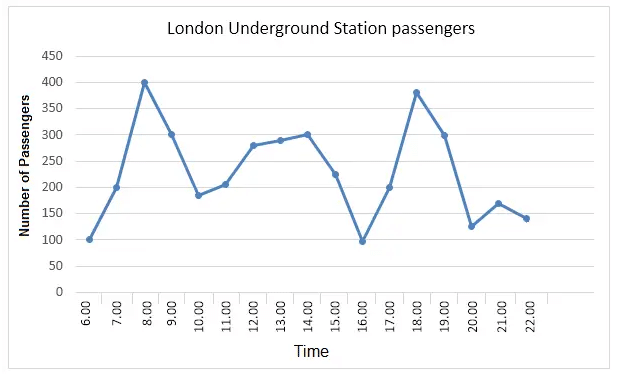
The given line graph shows the number of passengers who used London underground stations during the hours between 6 am and 10 pm.
Overall, it can be seen that the number of passengers kept fluctuating throughout the day. Underground stations had the lowest number of passengers at 6 am and 4 pm. Only around 100 passengers were present at the stations during these hours.
As the day advanced, the passenger count also increased and it was the highest at 8 am (400 passengers). Afterwards, the number of passengers dropped and at 10 am, there were fewer than 200 passengers at underground stations. Their numbers then increased until 2 pm and then started dropping and fell under 100 at 4 pm. Passenger numbers at underground stations started climbing after 4 pm and reached around 375 by 6 pm. Then it started falling and between 8 and 10 pm, there were fewer than 200 passengers at these train stations.
The charts below show the proportion of expenditure by students, on average, at one university, in 2000 and 2010. Summaries the information by selecting and reporting the main features, and make comparisons where relevant.
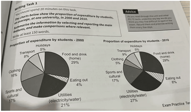
The charts illustrate seven different areas where university students spent money in the years 2000 and 2010. By far the most important area where students spent money in both years was on Food and drink (home), and this remained exactly the same percentage at approximately 30% of total expenditure. However, there were significant changes across the decade in the proportion of spending in all other areas. The most noteworthy difference was in the portion spent on Clothing: this decreased by more than 10% after 10 years, from 16% to just 5%. Other areas which show a growth in percentage terms were Transport (from 8% to 9%), Utilities (from 21% to 27%), and Eating out which doubled in the figure, starting from the lowest base (4%) in 2000, outstripped spending on Holidays and accounted for 8% of total expenditure in 2010. Two other areas that witnessed no change were Sports and cultural and Holidays, which made up 17% and 5% respectively.
The pie charts illustrate the proportion of money that students at a particular university spent on various areas in the years 2000 and 2010. It can be seen that in both years, students spent the most on food and drink and the proportion of this expenditure was exactly the same at 29% in both years. Utilities were the second biggest expense in both years and the spending on utilities actually increased from 21% in 2000 to 27% in 2010. The spending on sports and cultural was the same in both years at 17%. The most drastic change occurred in the spending on clothing which dropped from 16% in 2000 to just 5% in 2010. Meanwhile eating out expenses doubled from 4% in 2000 to 8% in 2010. While students spent exactly the same proportion of money on holidays in both years (5%), their expenditure on transport slightly increased from 8% in 2000 to 9% in 2010.
The chart below gives information about the purpose of visits to five cities in the UK in 2013. Summaries the information by selecting and reporting the main features, and make comparisons where relevant.
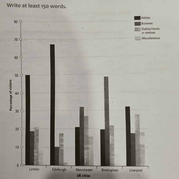
The given chart provides information about the purpose of visits to London, Edinburgh, Manchester, Birmingham and Liverpool in the UK in the year 2013.
Overall, it can be seen that Edinburgh ranked the highest in terms of the number of people visiting it for holiday. Over 65% of the total visitors to the town visited it for holiday. However, it ranked the lowest in terms of the number of business visitors. Only 10% of the visitors to the city were on a business trip. Edinburgh also had the lowest number of people visiting it for miscellaneous purposes. Fifty percent of the total visits to London were for holiday purposes. The percentages of people who visited the city for business or for visiting friends or relatives were about 20% each. It is evident that Birmingham topped the chart in terms of business visits. Around 50% of the total visitors to the city were on a business trip. Manchester is the second most popular business destination with around 30% of the total visitors visiting it for a business purpose. Manchester and Liverpool had the highest number of people visiting them for meeting friends and relatives.
To conclude, it can be seen that London, Edinburgh and Liverpool were mostly visited for holiday purposes whereas Manchester and Birmingham were mainly visited for business purposes.
The chart below shows the amount spent on six consumer goods in four European countries.
Write a report for a university lecturer describing the information shown below.
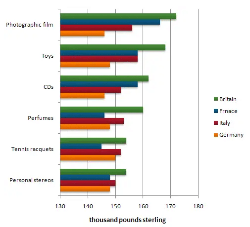
The given chart shows the amount of money spent on six items by consumers in Germany, Italy, France and Britain. Overall, it can be seen that Britain spent the most on all consumer goods whereas Germany spent the least on all items except two. The Brits spent nearly 170 thousand pounds on photographic films while the French spent about 165 thousand pounds on them. All the four nations spent nearly the same amount of money on personal stereos with Britain spending slightly more on them (150 thousand pounds). France spent the least on racquets (about 145 thousand pounds). The British spending on perfumes (160 thousand pounds) was considerably higher than what the other three countries spent on this item. Italy and France spent the same amount of money on toys (about 158 thousand pounds). While Germany spent only about 148 thousand pounds on this item, Britain spent as much as 170 thousand pounds. Except for Germany, all the other three nations spent the most on photographic films. Germany spent slightly more on racquets and perfumes than films.
The chart provides information regarding the amount of money spent on six items by consumers in Germany, Italy, France and Britain. It can be observed that the Brits spent the most on the all six goods. Germans, on the other hand, spent the least on all items except perfumes and tennis racquets. The French and the Italians spent almost the same amount of money on personal stereos and toys. However, in the case of tennis racquets and perfumes, Italy spent more than France. The trend reversed in the case of CD’s & photographic films where France spent more than Italy. Overall, it can be seen that the photographic film is the most preferred consumer item in Europe. The second place goes to toys and CDs occupy the third place. Europeans spent the least on tennis racquets and personal stereos. Perfumes were also not a popular consumer item except in Britain.
The chart shows the average money spent per customer on various types of equipment in a Canadian sports store.
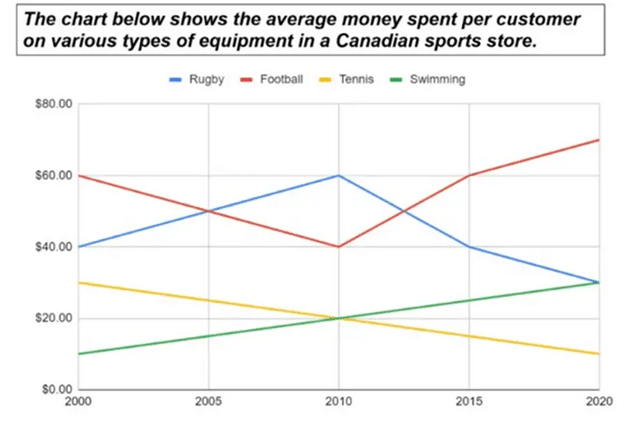
The line graph shows the amount of money that customers spent on average on various sports equipment in a store in Canada.
Overall, it can be seen that consumers spent the most money on football equipment at the beginning and at the end of the period. While on average, they spent 60 dollars on football gear in 2000, this spending had increased to 70 dollars in 2020. However, this growth wasn’t continuous. Actually, spending on football equipment dropped from 2000 to 2010 and then it started increasing again. Spending on tennis equipment continued to drop throughout the given period. While in year 2000, it was 30 dollars per customer, by 2020, it dropped to 10 dollars/customer. Customers spent the most on rugby gear in 2010 (60 dollars/customer). Afterwards it started falling and over the next ten years, it halved. The sale of swimming gear continued to increase during the given period from just 10 dollars/customer in 2000, to 30 dollars / customer in 2020. In fact, the sale of swimming equipment followed a pattern exactly opposite to that of the sale of tennis equipment.
The line graph illustrates how much money shoppers spent on different types of sporting equipment at a sports shop in Canada.
Overall, customer spending on football and swimming equipment increased by the end of the period, whereas spending on tennis and rugby decreased. Customer spending on football gear was the highest in 2000 at 60USD/person. It decreased drastically over the next ten years and reached 40USD/person in 2010. Afterwards, it increased significantly and by 2020, each customer was spending on average 70USD on football equipment. Spending on swimming equipment was the lowest in 2000 at 10USD/person but it increased steadily over the next 20 years and reached 30USD/person in 2020. Although there was an increase of 20 dollars in the sale of rugby equipment between 2000 and 2010, sales of this sport equipment decreased from around $60 in 2010 to $32 in 2020. Sales of tennis equipment decreased throughout the given period from 30 USD/person in 2000 to 10 USD/person in 2020.
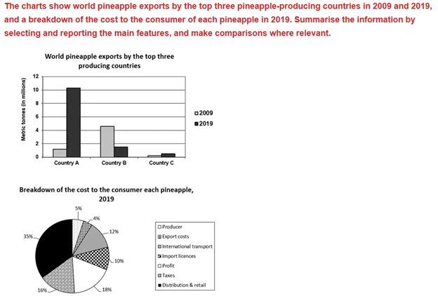
The bar chart gives information regarding the quantity of pineapples exported by three countries in 2009 and 2019. While in year 2009, country B was the biggest exporter of pineapples, in 2019, country A beat them by a large margin. While in year 2009, country A exported 1 million metric tonnes of pineapples, country B exported nearly 5 million metric tonnes. In 2019, exports by country A skyrocketed to reach 10 million metric tonnes. Meanwhile, pineapple exports by country B fell under 2 million metric tonnes. In both years, exports by country C were negligible.
The pie chart shows the various components that made up the cost of each pineapple in 2019. While distribution and retail accounted for 35% of the total cost of pineapple, the production cost was only 5%. The seller made a profit of 18% every time a pineapple was sold and taxes accounted for 16% of the total cost. The other costs that made up the total cost were export costs (4%), international transport costs (12%) and import licenses (10%).
The bar chart gives information about the quantity of pineapple exported by the top three pineapple-producing countries in million metric tonnes in 2009 and 2019, while the pie chart illustrates the various components that made up the cost of each pineapple for the consumer in 2019. Overall, the quantity of pineapple exported by country A and country B differed significantly in 2009 and 2019. It is also noticeable that the export costs accounted for the lowest percentage of the cost of each pineapple. While in 2009, country A exported only 1 million metric tons of pineapple, in 2019, they exported as much as 10 million metric tonnes. In the case of country B, the export volume dropped from 4.5 million metric tonnes in 2009 to 1.75 million metric tonnes in 2019. As for the various components of the cost of each pineapple, the highest was distribution and retail (35%) and the lowest was export costs (4%). The profit of the seller accounted for 18% of the total costs.
The diagram below shows the recycling process of plastic. Summaries the information by selecting and reporting the main features, and make comparisons where relevant.
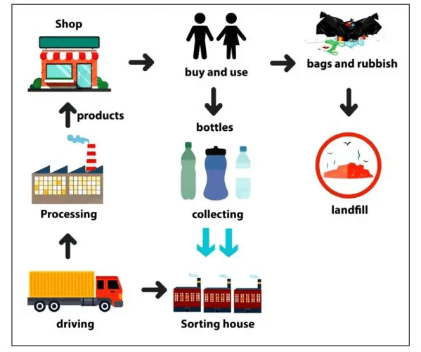
The process diagram illustrates the various processes / stages involved in the recycling of plastic. Overall, it can be seen that not all plastic products are recycled. While some reach landfills where they accumulate polluting the soil, others reach recycling centres. People buy plastic products like bottles, bags and other items from shops and then use them. After using these products for a while, they discard them. While plastic bags and rubbish reach landfills where they do not get recycled and thus pose a threat to the environment, plastic bottles are usually recycled. They are collected and transported to sorting houses where they get separated into various types. These sorted bottles are then transported to recycling centers where they get recycled and used to produce various plastic products. These products again reach supermarkets from where consumers buy them, use them and discard them and the cycle repeats all over again. Some plastic will again make it to the landfills whereas the remaining gets recycled.
The maps below show an industrial area in the town of Norbiton, and planned future development of the site. Summarize the information by selecting and reporting the main features, and make comparisons where relevant.
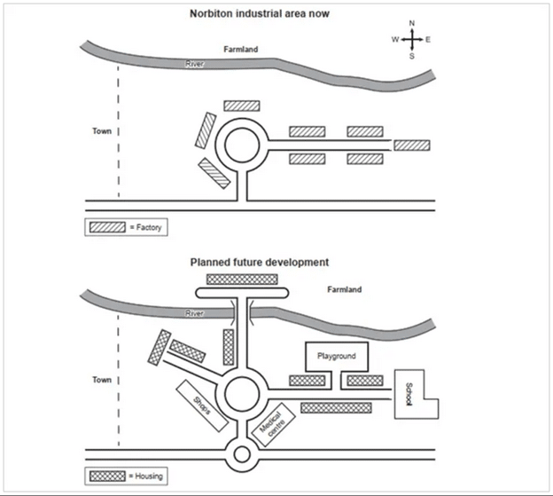
The given illustration shows the current state of a town called Norbiton and its development in the future. As can be seen from the graph, the current industrial zone will be repurposed and remade to be a residential area. Besides, various amenities and new avenues will be constructed in the site. A new roundabout will be built and it will be connected to the existing roundabout at the center of the town, making it easier for citizens to travel / get around. A new path will be made on the westside with shops on its left and houses on its right. A new bridge will be built across the river and the farmland will be smaller in area as new housing will come up in the area. The existing factories on the eastside of the town will be demolished and homes and a school will be built in their place. Also, a new playground and a road to access it will be built near the school. In addition, a new medical centre will be built in the southeast of the town.
The chart below shows the amount of leisure time enjoyed by men and women of different employment status. Write a report for a university lecturer describing the information below.
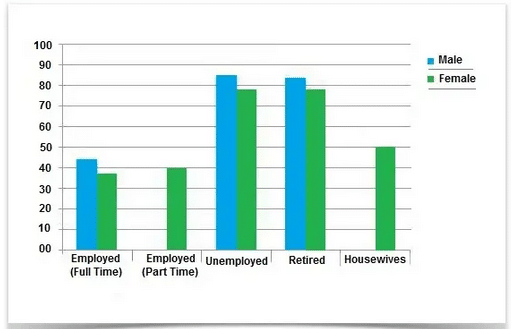
The bar chart illustrates the hours of free time men and women enjoyed during the week. Overall, it is quite apparent that men had more time for leisure pursuit than women and jobless and retired people had more hours for free time enjoyment. By contrast, both men and women working full time had less time for leisure. To start with, unemployed men had the highest amount of free time. On average, they were free for 82 hours/week. Retired men also enjoyed about 80 hours of free time per week. By contrast, employees working full time had much less free time. While working men had about 40 hours of free time per week, working women had only 35 hours/week for leisure. Women working part time had slightly more free time (40 hours / week) than women working full time. Housewives had considerably more hours for leisure than women working part time or full time.
The chart shows components of GDP in the UK from 1992 to 2000. Summarize the information by selecting and reporting the main features and make comparisons where relevant.
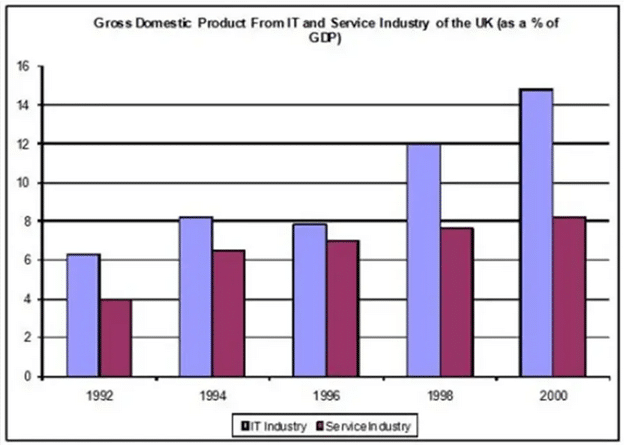
The bar chart shows the contribution of IT and Service Industry to the gross domestic product of the UK during the period between 1992 and 2000. Overall, it can be seen that throughout the given period the IT sector contributed more than the service sector. In 1992, while the IT industry contributed a little more than 6% to the GDP, the contribution of service industry was 4% in the same year. By 1994, both sectors had increased their contribution by about 2%. Over the next two years, the contribution of the IT industry dropped a little whereas that of the service industry grew a bit. By 1998, the IT industry had grown quite a bit and contributed 12% to the GDP. During the same period there was not much increase in the contribution of the service sector. In 2000, about 15% of the UK GDP was contributed by the IT sector. The contribution of the service sector was 8%. Overall, it can be seen that the IT sector grew tremendously over the years and contributed twice as much as the service sector in 2000.