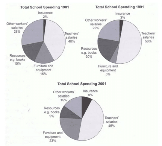
The pie charts show variation in the annual expenditure on various items by a UK school during the three years 1981, 1991 and 2001. In each of these three-years teachers’ salary was the biggest expense. While in 1981, 40 percent of the annual budget was spent on teachers’ salaries, the spending on this area increased to 50% in 1991 before falling slightly to 45% in 2001. By contrast, the percentage of money spent for paying other workers’ salary almost halved from 28 percent in 1981 to 15 percent in 2001. Expenditure / spending on resources such as books and Furniture and equipment fluctuated. While spending on the former fell to less than one-tenth of the total budget after a rise in 1991, spending on furniture and equipment rose to almost a quarter of the annual expenditure in 2001. Insurance spending was negligible in 1981 (2%) but it rose steadily to 8% by 2001.
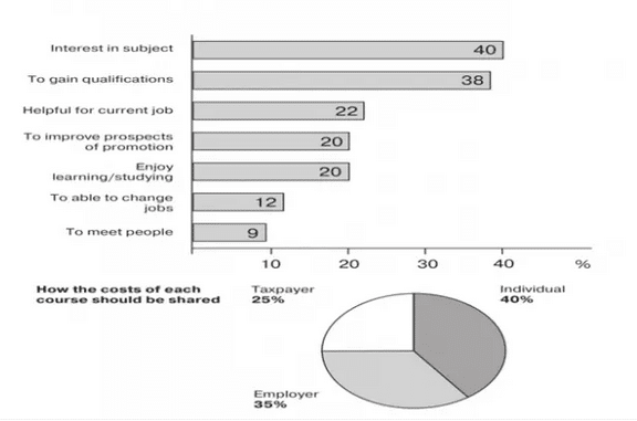
The graph shows information about adult education. The bar chart shows popular reasons chosen by adults to take up studies, while the pie chart depicts the opinion of people on who should fund these studies. Overall, interest in the subject and the need to gain qualification are the reasons for 2/5th of the respondents to pursue studies. Around one in five study as they believe it will aid in their current job or facilitate their promotion, and a similar share of adults responded that they take up studies because they enjoy learning. And one in ten people choose to study as they think it will help them change jobs while the least popular reason stated is to meet new people. As for the cost / regarding the cost of education, almost 40 percent of people think it should be borne by the learners while a similar proportion of people want it to be funded by the employers. Roughly a quarter of the people believe that it should be the responsibility of the government.
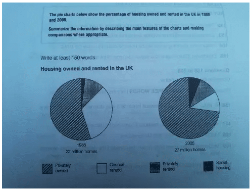
The pie chart illustrates the percentage of different types of owned and rented housing in the UK in 1985 and 2005. In 1985, there were 22 million homes and it can be seen that there was an addition of 5 million homes to reach a total of 27 million by the year 2005 in the UK. While the percentage of privately rented housing remained constant (10%) in both the years the proportion of social housing increased marginally from 2% in 1985 to reach 6% of the total homes in 2005. There was a significant increase in the percentage of privately owned residences which rose from 55% in 1985 to 73% in 2005. This type of housing constituted the highest percentage among all in both the years. On the other hand, there was a remarkable decrease in council rented homes and their percentage dropped from 33% in 1985 to 11% in 2005.
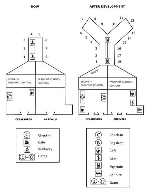
The given plans show the present state of an airport and its look after the proposed redevelopment. Overall, it can be seen that the airport will undergo considerable change. The most striking change after redevelopment will be the addition of 10 extra gates. Right now the airport has 8 gates numbered 1-8. After redevelopment it will have 18 gates built around a Y shaped structure. Right now, on the left side of the airport, there is security and passport control. The departure area consists of a check in and a cafe. The arrivals section is on the right side of the airport. Passengers have to first go through the customs and then passport control before they can exit through the gates. There is a walkway to travel between the gates.
After redevelopment, the walkway will be replaced by a sky train. Some new shops will be built close to the gates on the left side of the airport. The security and passport control areas will not undergo any change. The check-in will be moved to the right side of the departure lobby. The cafe will be moved to bottom left and a new bag drop will be set up in the area that was previously occupied by check-in. The arrivals lobby will now have a cafe and an ATM. In addition, it will have a corner for hiring cars.
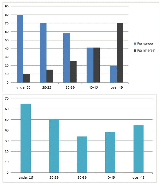
The charts show the reasons for which students of various age groups study and the amount of support they received from their employers in terms of financial assistance and time off. Overall, it can be seen that young people are more likely to pursue studies for career growth rather than interest. This trend reverses as people age. While as much 80% of those aged under 26 choose to study with the objective of furthering their career, only about 20% of those over 49 study for the same reason. An equal proportion of people (40% each) aged between 40 and 49 studies for career and interest. Meanwhile, 70% of those over 49 studies for interest.
As for employer assistance, the biggest beneficiaries were those aged under 26. While as much as 65% of them received the support of their employers, this support started falling as people aged. Those aged between 30 and 39 received the least amount of support at about 33%. Interestingly, employers offered greater support to older employees to continue education. While about 38% of those in the 40-49 age bracket were supported by their employers, those over 49 received even more assistance.
The charts show the main reasons for study among students of different age groups – Band 7.5 IELTS report sample
The chart provides information related to the purpose of study among people aged from 26 to 49 years and the support they received from their employers in terms of time off and money aid. As for the reasons to study / regarding the reasons to study) reasons to study, it can be seen that with the increase in age, people are more likely to pursue studies out of interest rather than for career growth). It is evident that around 70% of people over the age of 49 prefer to study for interest and it is 7 times higher than the percentage of young people (under 26) pursuing study for the same reason. On the contrary, 80% of younger people prefer studying to stabilize their careers in their initial years while this preference keeps declining gradually as they age and only 40% of people in the 40-49 age bracket study for career purposes. Among this age group, an equal proportion of people study for career and interest. Employers are more likely to support those under 26 years of age. As much as 62% of them receive employer assistance. This support reduces as the employees grow older and those in the 30-39 age group receive the least support.
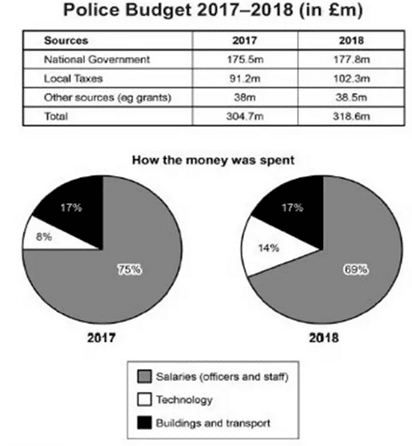
The table shows the amount of money that a police department in the UK received in 2017 and 2018 from various sources whereas the chart shows how this money was spent.
Overall, it can be seen that the national government contributed the most to the police budget in both years. Local taxes were the second most important source of money. Other sources such as grants contributed the least. While in 2017, the government allocated 175.5m pounds for the police budget, this amount increased marginally to 177.8m pounds in 2018. The contribution of local taxes was 91.2m pounds in 2017 and 102.3m pounds in 2018. The contribution of other sources remained more or less the same in both years at around 38 m pounds. In both years, much of the budget was spent on salaries. While in 2017, 75% of the total budget was used to pay salaries, in 2018, the proportion of money used for this purpose reduced to 69%. The proportion of money spent on buildings and transport was the same in both years at 17%. Meanwhile, the spending on technology increased from 8% in 2017 to 14% in 2018.
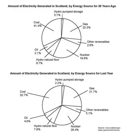
The two pie charts show the contribution of various sources to the generation of electricity in Scotland in two years – last year and 20 years before that.
Overall, while the proportion of the given energy sectors differ in the two years, coal, gas, and nuclear represent the most significant sources of energy in both the given periods of time.
Coal was the most significant source of energy in both years accounting for 41% and 32% of the energy generated in 2001 and 2021. The contribution of gas didn’t change much and in both years and was nearly 22%. Meanwhile, the contribution of nuclear power increased by almost 7% from 19.6% in 2001 to 26.4% in 2021.
Just like gas, the contribution of hydro natural flow didn’t change much in both years and hovered around 8-9%. Similarly, hydro pump storage was used to make 3.1% of Scotland’s electricity 20 years ago and its contribution dipped to 2.2% in the last year. Conversely the amount of energy generated from oil and other renewable sources, though negligible, nearly doubled over the last 20 years.
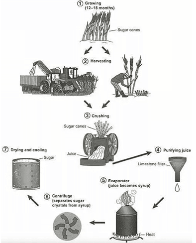
The pictures illustrate the various processes involved in the production of sugar from sugarcane. There are mainly 7 stages in the production of sugar. It starts with the cultivation of sugarcane. Farmers grow sugarcane in their fields and in about 12 – 18 months it is ready for harvesting. The harvesting is done either manually or using a machine. The harvested canes are then crushed using a crushing machine and their juice is extracted. This juice is then purified using a limestone filter. The purified juice is then converted into syrup by heating it on an evaporator. The sugar syrup has to undergo another process before sugar can be produced. This process involves centrifugation. The syrup is centrifuged to separate the sugar crystals. The sugar crystals thus separated are then dried and cooled. Once they are cooled, we get sugar that is ready for consumption.
Band 7 report sample 2
The diagram details the processes involved in the manufacturing of sugar from sugarcane.
Overall, there are two main stages involved in sugar production. To begin with, sugarcane plants need between 12 and 18 months of growth before they are harvested. The harvesting step can be done either manually or with the assistance of machines that cut the sugar canes and store them in a container. Moving forward to the production of sugar, the canes first enter a crusher machine which extracts the juice. The Juice then passes through a limestone filter for purification purposes. Subsequently, the purified juice is heated up in an evaporator. This process converts the juice into syrup. Next is the centrifuging process. In this stage, the syrup flows into the centrifuge and sugar crystals get separated from the syrup. Finally, the produced sugar crystals are cooled and dried and stored in barrels.
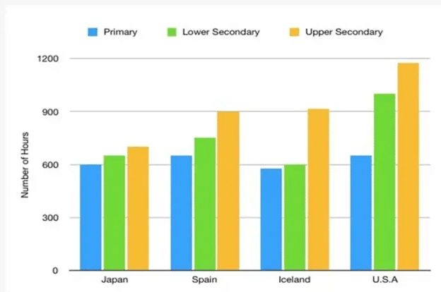
The chart shows the number of hours primary, lower secondary and upper secondary teachers taught in four countries.
Overall, it can be seen that lower secondary and upper secondary teachers in the US taught considerably more hours than teachers of the same grades in the other three countries. Primary and lower secondary teachers in Iceland have the fewest working hours at around 600. Interestingly, upper secondary teachers in Iceland have a much bigger workload of roughly 900 hours. In Japan, the difference between the number of hours worked by teachers of different grades is negligible with all of them working between 600 and 700 hours. In Spain, while primary teachers work around 650 hours, lower secondary and upper secondary teachers work 750 and 900 hours respectively. In the US, primary teachers work only around 650 hours, whereas lower secondary and upper secondary teachers work 1000 and 1200 hours respectively. Obviously, primary teachers work nearly the same hours in all countries. In Spain, the workload of teachers increases gradually as they move from lower grades to higher grades whereas in the US, this rise is more drastic.